
About The Project
About The Project
Designing TOTs Parents Mobile Application
Designing TOTs Parents Mobile Application
TOTs Parent Application is a community driven mobile application designed exclusively for mothers to connect, share parenting experiences, seek advice, learn, and find emotional support. The app provides a safe and inclusive digital space where moms can discuss motherhood challenges, child development, and personal well-being without judgment.
The design challenge was to create an experience that was both powerful and easy to use, ensuring users could effortlessly navigate through the app. TOTs Parent Chat Application is designed to create a supportive and dedicated platform for mothers to engage in meaningful conversations. We focused on developing a cohesive visual identity that aligns with the TOTs Parent brand, providing a consistent and engaging user experience.
TOTs Parent Application is a community driven mobile application designed exclusively for mothers to connect, share parenting experiences, seek advice, learn, and find emotional support.
The app provides a safe and inclusive digital space where moms can discuss motherhood challenges, child development, and personal well-being without judgment.
The design challenge was to create an experience that was both powerful and easy to use, ensuring users could effortlessly navigate through the app.
TOTs Parent Chat Application is designed to create a supportive and dedicated platform for mothers to engage in meaningful conversations. We focused on developing a cohesive visual identity that aligns with the TOTs Parent brand, providing a consistent and engaging user experience.
My Role
My Role
My Role
UI/UX Design
UI/UX Design
Client
Client
Client
Literesults Services
Literesults Services
Date
Date
Date
December, 2024
December, 2024
Status
Status
Status
Officially launched: Available on both App Store and Play Store.
Officially launched: Available on both App Store and Play Store.
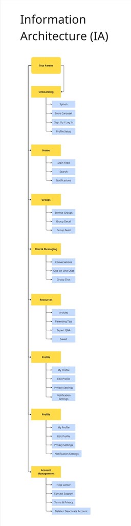
The Tots Parent Information Architecture structures the app into clear sections, guiding moms from onboarding to community engagement. It ensures smooth navigation, quick access to chats and resources, and a supportive space for sharing and connecting.
The Tots Parent Information Architecture structures the app into clear sections, guiding moms from onboarding to community engagement. It ensures smooth navigation, quick access to chats and resources, and a supportive space for sharing and connecting.
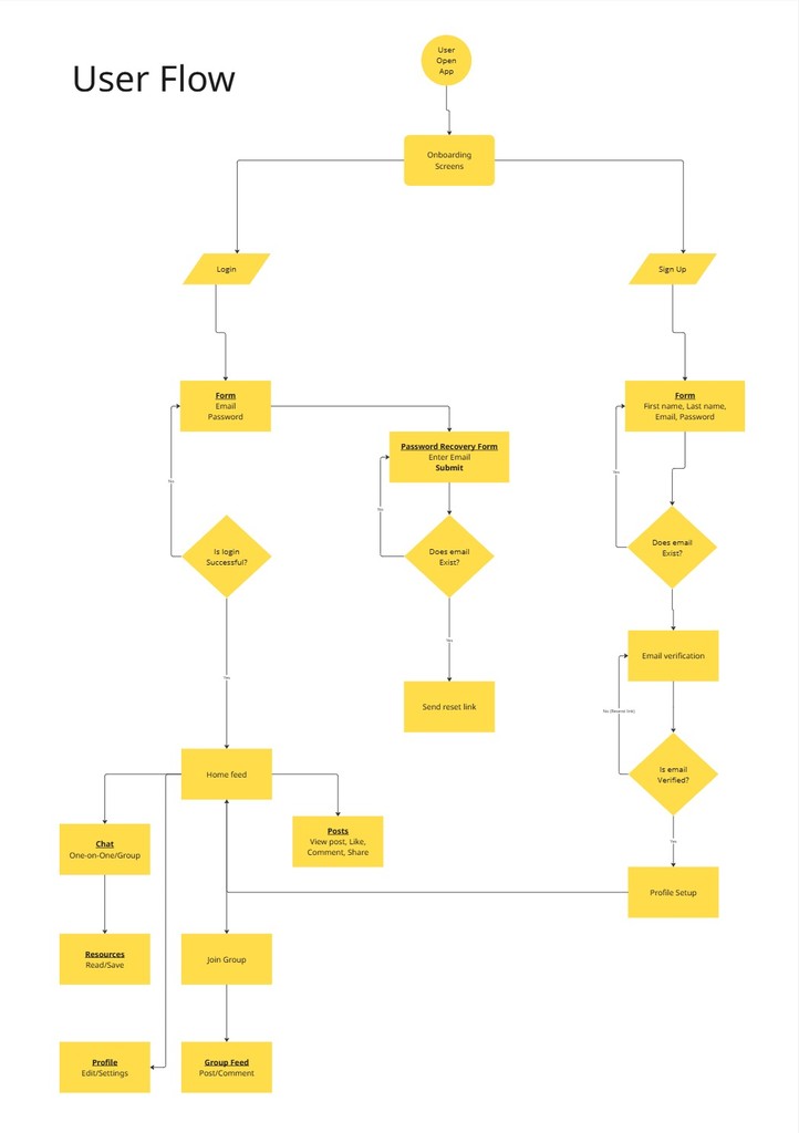
The Tots Parent user flow maps the step-by-step journey moms take within the app, from first launch and onboarding, through account creation, to engaging in groups, chats, and resource sharing. It’s designed to minimize friction, encourage community interaction, and guide users seamlessly toward forming meaningful connections and accessing valuable parenting content.
The Tots Parent user flow maps the step-by-step journey moms take within the app, from first launch and onboarding, through account creation, to engaging in groups, chats, and resource sharing. It’s designed to minimize friction, encourage community interaction, and guide users seamlessly toward forming meaningful connections and accessing valuable parenting content.

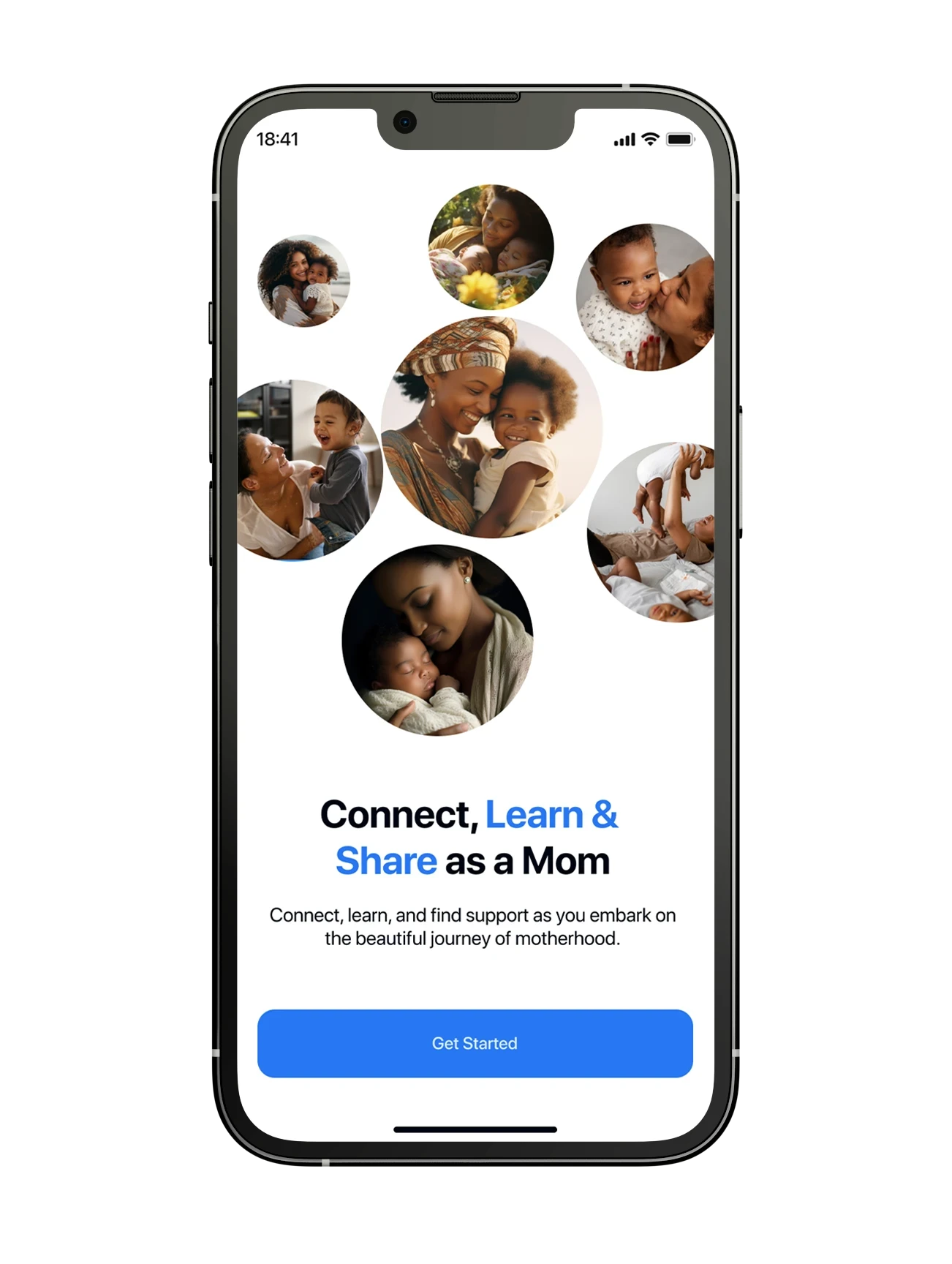
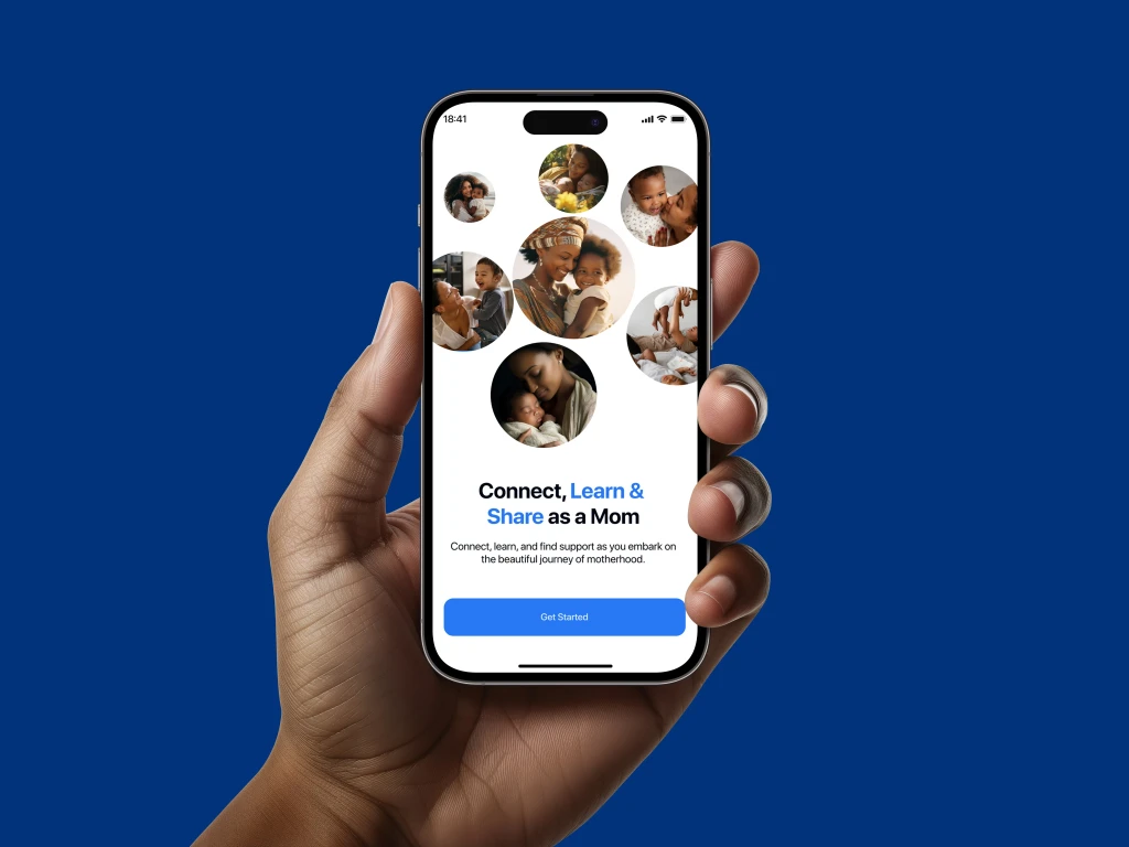
TOTs Parent App splash and onboarding flow
TOTs Parent App splash and onboarding flow.
We've wireframed and designed the first version of the TOTs iOS application, which has been a complete design version. In total we created high-fidelity visual designs of more than 45 different views and states.
Onboarding flow
Onboarding flow
While designing the TOTs App, I wanted to create an experience that felt warm, inviting, and emotionally engaging for mothers.
Traditional flat icons and minimalistic graphics, while clean and functional, sometimes lack warmth. Parenting is deeply emotional, filled with joy, struggles, and learning moments. To reflect this, I chose soft, friendly 3d illustrations that brought a sense of depth and realism to the interface.
While designing the TOTs App, I wanted to create an experience that felt warm, inviting, and emotionally engaging for mothers.
Traditional flat icons and minimalistic graphics, while clean and functional, sometimes lack warmth. Parenting is deeply emotional, filled with joy, struggles, and learning moments.
To reflect this, I chose soft, friendly 3d illustrations that brought a sense of depth and realism to the interface.
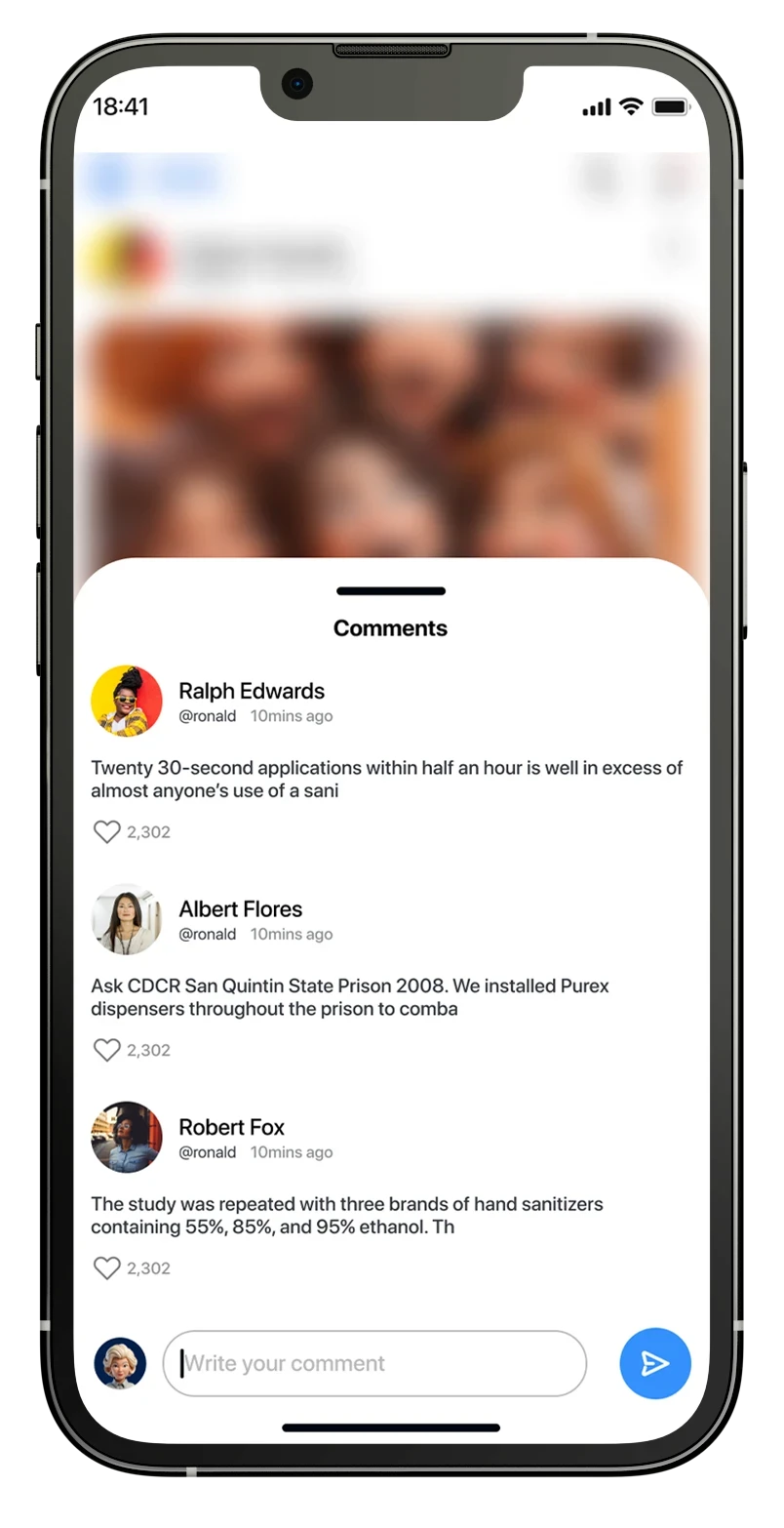
Home/feed and comment flow
Home/feed and comment flow
When designing the home/feed and comment flow for the TOTs App, I wasn’t just creating layouts, I was crafting and shaping an experience that felt like home for mothers. A space where they could scroll effortlessly, engage meaningfully, and feel an instant sense of belonging.
The home screen is the heartbeat of the app. It’s where moms land first, where conversations start, and where stories unfold. After my findings through interviews, I knew this screen had to feel:
✅ Intuitive: Easy to browse with clear hierarchy.
✅ Engaging: Content should feel relevant and personalized.
✅ Comforting: A soft, welcoming visual design that puts users at ease.
When designing the home/feed and comment flow for the TOTs App, I wasn’t just creating layouts, I was crafting and shaping an experience that felt like home for mothers.
A space where they could scroll effortlessly, engage meaningfully, and feel an instant sense of belonging.
The home screen is the heartbeat of the app. It’s where moms land first, where conversations start, and where stories unfold. After my findings through interviews, I knew this screen had to feel:
✅ Intuitive: Easy to browse with clear hierarchy.
✅ Engaging: Content should feel relevant and personalized.
✅ Comforting: A soft, welcoming visual design that puts users at ease.
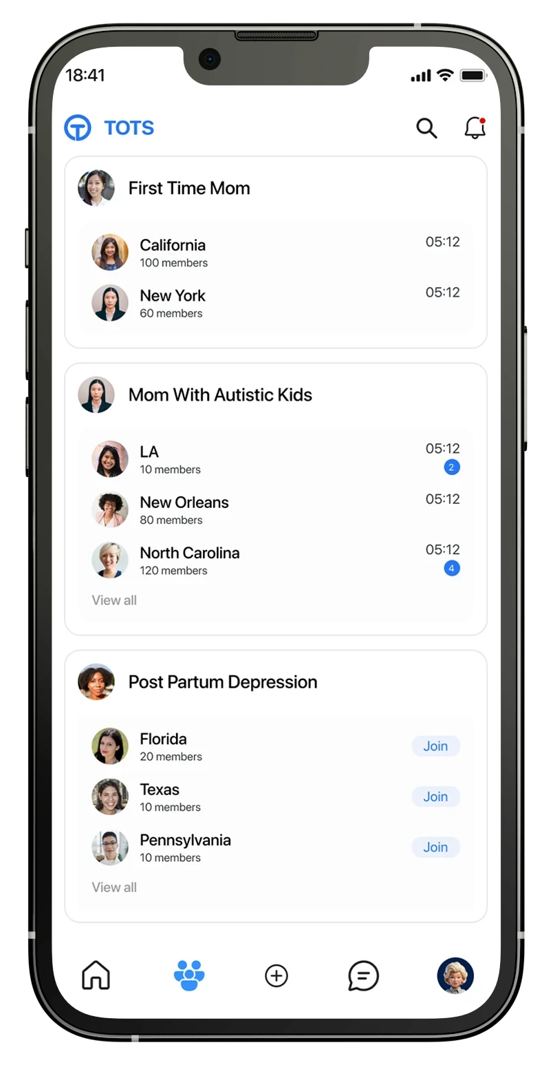
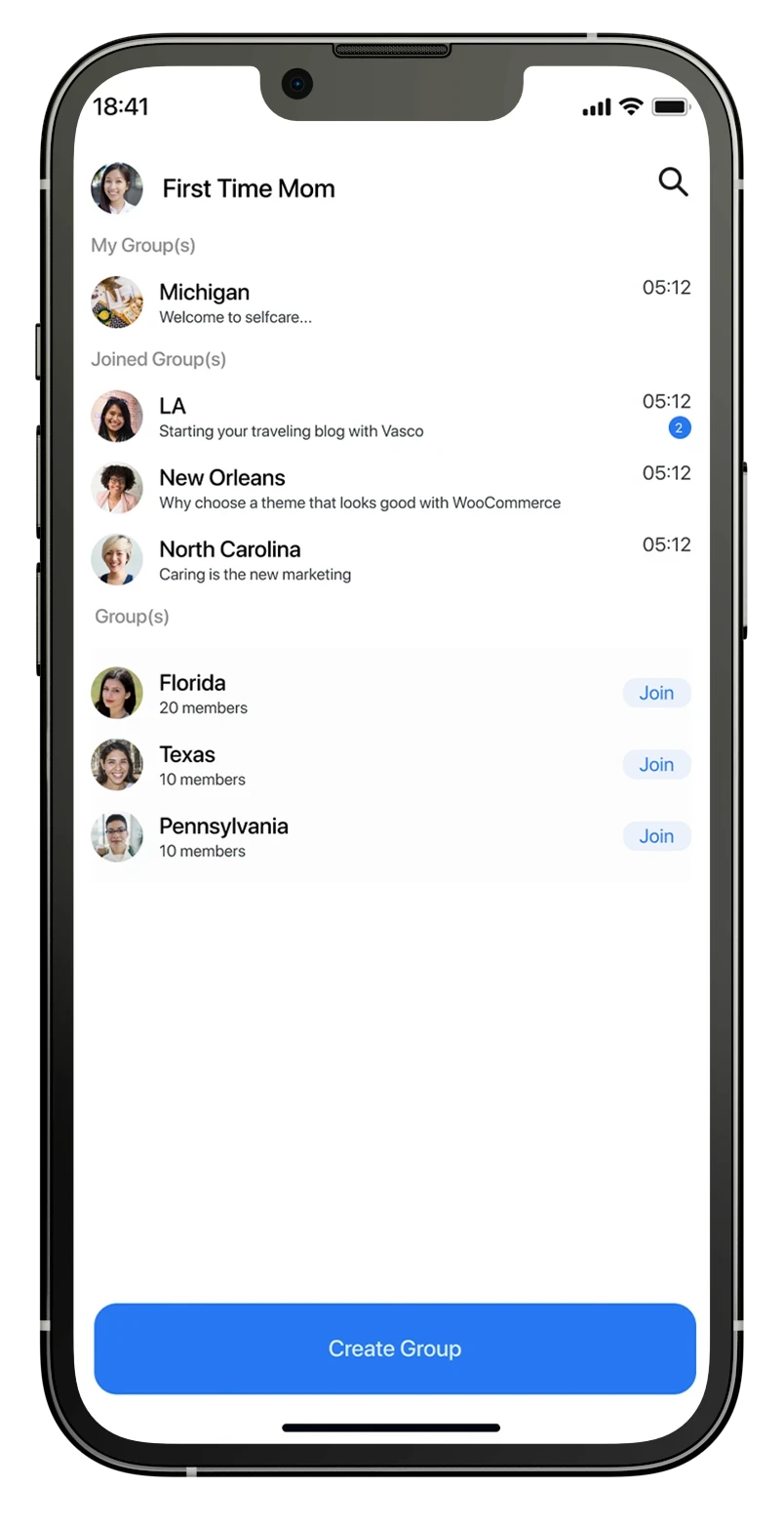
Group/chat flow
Group/chat flow
I envisioned more than just a messaging interface, I was crafting a sanctuary for connection. Motherhood can feel isolating, and TOTs had to bridge that gap, making every interaction feel warm, supportive, and effortless.
A Digital Village for Moms "did i just said village" yes!
Mothers have always thrived in communities, whether through family, friends, or local support groups. The group needed to reflect this sense of belonging while staying easy to navigate.
A Personalized and Organized Structure
Instead of a cluttered list of groups, we designed a smart categorization system:
✅ First Time Moms: for first-time parenting.
✅ Mom With Autistic Kid: for moms to share their wins and challenges.
✅ Postpartum Depression: for moms to talk about postpartum depression.
This allowed moms to quickly find and join groups where they felt most comfortable.
I envisioned more than just a messaging interface, I was crafting a sanctuary for connection. Motherhood can feel isolating, and TOTs had to bridge that gap, making every interaction feel warm, supportive, and effortless.
A Digital Village for Moms "did i just said village" yes! uhmm…
Mothers have always thrived in communities, whether through family, friends, or local support groups. The group screen needed to reflect this sense of belonging while staying easy to navigate.
A Personalized and Organized Structure
Instead of a cluttered list of groups, we designed a smart categorization system:
✅ First Time Moms: for first-time parenting.
✅ Mom With Autistic Kid: for moms to share their wins and challenges.
✅ Postpartum Depression: for moms to talk about postpartum depression.
This allowed moms to quickly find and join groups where they felt most comfortable.